


Which Fence Colour Will Suit My House and Garden?
October 26, 2026

A fence colour can look ideal on a small sample and feel different once it stretches across your property. If you are choosing a colour for your Newcastle home, matching the roof is only one possible starting point. Your brickwork, paving, window frames and garden may have a stronger influence on how the finished boundary looks. Lake Macquarie Fencing helps homeowners compare fencing options and finishes for their properties.
A reliable choice comes down to three considerations: the colours already present at your home, whether the fence should stand out or blend into the garden and how the actual finish looks outdoors. By checking these details before installation, you can narrow your options and avoid discovering that an apparently neutral colour clashes with the surrounding exterior.
Start with the surfaces that will remain visible besides the fence rather than trying to match every exterior element. A coordinated palette can include several different colours, provided they have a clear relationship.
For homes, that relationship might come from warm brickwork, pale render, darker window frames or the paving besides the boundary. The best starting point is usually the permanent surface that occupies the most prominent part of the view, followed by one or two supporting elements.
Walk to the street and look back towards the boundary from your garden. Notice which surfaces dominate each view. A broad brick wall besides a side fence may matter more than a roof that is barely visible from the outdoor living area.
Separate permanent finishes from features you expect to change. If you plan to repaint a wall soon, its current colour should not dictate the fence. Likewise, outdoor cushions and pots are easier to replace than paving or window frames.
Choose one main reference surface and one or two supporting elements. This gives you a manageable shortlist without requiring the fence to match everything. For example, a fence might relate to the window frames while sitting comfortably besides the brickwork, even though none of those finishes is identical.
An undertone is the underlying colour within an apparently neutral finish. Grey paving may lean blue, green or brown, while cream render may have a yellow or pink cast. These differences become more noticeable when another colour sits directly besides them.
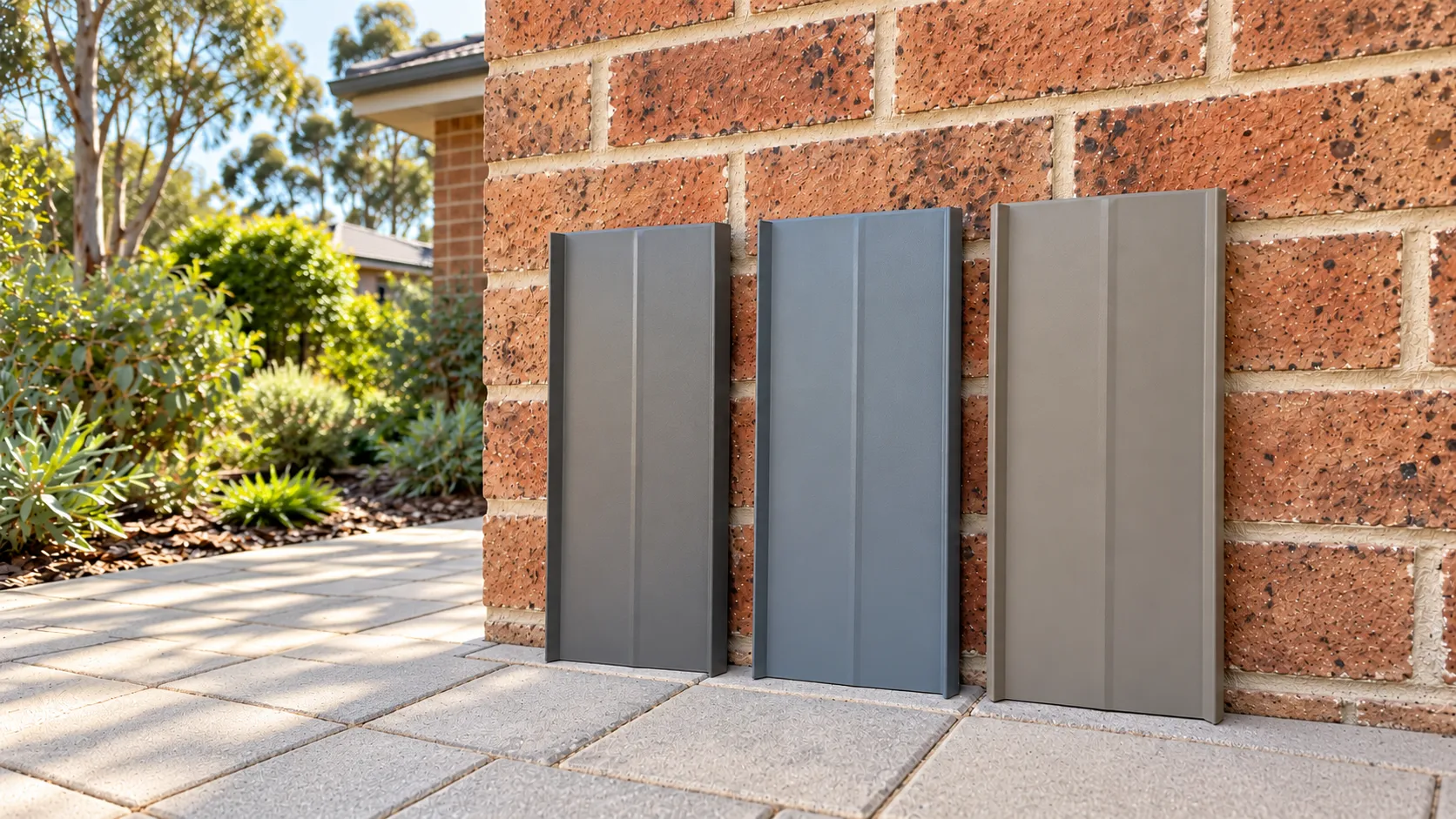
This is why two neutral colours can clash. A cool, blue-based grey fence may make warm beige paving appear more yellow, whereas a brown-based grey can feel more harmonious with the same surface. Neither is inherently better; the surrounding palette determines the effect.
For colours that complement brick homes, look beyond the darkest or brightest individual brick. Step back to assess the overall blend and consider the mortar, which may provide a more subtle reference point than trying to reproduce a red, orange or mottled brick face.
A warm charcoal or brown-based grey may complement red and orange brickwork, while a muted earthy neutral can work well besides beige paving and natural stone. These combinations are useful starting points rather than fixed rules, so compare physical samples against the actual exterior before deciding.
The roof is worth considering, particularly when it is prominent from the street. However, repeating its exact colour across a large vertical surface can give the boundary more visual weight than intended.
Instead, consider a related colour with a compatible undertone. A charcoal fence might echo darker roof details or window frames without matching every element precisely. Against a lighter rendered exterior, this contrast can create a defined boundary while maintaining a connection to the home.
If the roof and paving have different undertones, compare samples from the main viewing positions to decide which relationship matters most. The goal is a balanced exterior rather than an exact match between every surface.
Before collecting colour ideas, decide what role the boundary should play. It could frame the home as a visible feature or provide a restrained background for the garden.
Prominence depends on contrast, not simply whether a colour is light or dark. The same finish can blend into one setting and stand out sharply in another, depending on the surrounding surfaces, foliage and amount of natural light.
A darker fence can recede behind dense foliage because it creates less contrast with the shaded spaces between leaves. This can help the shapes and colours of plants become the focus rather than the boundary itself.
That effect is not automatic. A dark fence besides pale paving, an open lawn or a light wall may create a strong outline. If planting is sparse, more will remain visible, so consider the garden as it looks now as well as how it may look when plants mature. Thoughtfully combining fencing and landscaping can help soften the boundary’s appearance while improving privacy as planting matures.
A lighter fence can also feel unobtrusive when it connects with pale render or paving. However, it may stand out behind dark foliage. Assess the colour against the immediate surroundings rather than assuming a particular shade will make the yard look larger.
At the front of the property, a more defined boundary can give the entrance a clear visual presence. A contrasting colour can achieve this, but it should have a connection to the house so the fence does not look unrelated.
For example, charcoal fencing may echo dark window frames against a light exterior, while a softer neutral may complement the mortar or paving and allow the front door and planting to remain the main points of interest.
Consider gates and posts as part of the overall design. A contrasting gate can draw attention to the entrance, while matching components can make the boundary appear more continuous. Compare the proposed colours together rather than judging the fence panels in isolation. Exploring different fence design ideas can help you consider how colour, materials and decorative details work together at the front of your home.
A single boundary may pass besides a rendered wall, across an open area and behind shrubs. Its colour can appear more prominent in some stretches than others, even when the finish remains consistent.
Pay attention to corners, posts and gate openings, where changes in the surrounding surfaces can alter how the colour is perceived. If one finish needs to work across several settings, assess it against the most exposed section and the most heavily planted area.
Physical samples are one of the most reliable ways to assess a shortlist against your home. Phone images and digital colour charts can help establish an initial preference, but they cannot reproduce how a finish interacts with brickwork, outdoor light and surrounding shade.
Keep the shortlist manageable. Comparing two or three suitable options in the actual setting is usually more useful than browsing dozens of colours without a clear reference point.
Ask for samples of the actual proposed finish wherever possible. A printed colour chart or painted card may not reproduce the texture and sheen of the finished fence, even when it provides a reasonable starting impression. For COLORBOND® steel fencing, you can order physical colour samples to compare with your brickwork, paving and window frames outdoors.
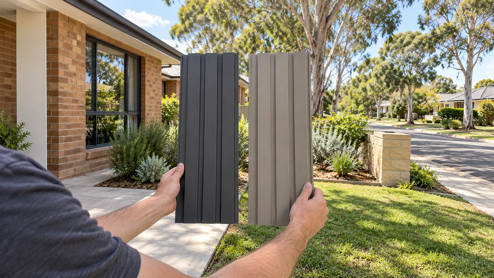
Hold each sample upright near the intended position and compare it with the main permanent surfaces. Check the brickwork or render first, followed by the paving and any visible window frames. This makes differences in undertone easier to identify.
View each option separately as well as side by side. A larger sample or display section is more useful because a small swatch cannot fully convey the visual weight of an entire boundary. Step back several metres to judge how the colour looks at a realistic viewing distance.
Direct sunlight can make a finish appear brighter, while shade may emphasise cooler tones. Reflected light from paving, walls and foliage can also affect the way a colour appears.
Texture and sheen matter too. A surface that catches highlights may look lighter or more noticeable than a flatter finish in a similar colour. Keep the sample in a realistic vertical position rather than laying it flat on a table.
Check the samples at different times of day, when the garden is normally used. Assess them from the street and the main outdoor living area, then use photographs as reminders rather than as the final basis for comparison. Phone cameras can adjust exposure and colour balance, disguising differences that are visible in person.
Once you have a preferred colour direction, confirm which options are available for the selected fencing system. Similar colour names do not necessarily mean identical appearances across different materials, finishes or components.
For example, Colorbond steel, timber and aluminium fencing can offer different colour ranges and surface characteristics. Timber may also have a natural grain and finish that influence its final appearance, while coated metal fencing relies more heavily on the selected colour and coating.
When comparing fencing in Newcastle, Lake Macquarie Fencing can confirm which colours and finishes are available for the fence, gates and posts being quoted. Ask for a clear identification of the proposed finish so the sample comparison relates to what will actually be supplied.
If the preferred option is unavailable, compare the closest alternatives outdoors rather than accepting a substitution based on a screen image alone. Have the agreed colour and finish recorded in the quote, including any intentionally contrasting components, before approving the work. The NSW Government’s guidance on getting accurate quotes recommends checking that the written quote lists the intended materials and reflects your specifications.